
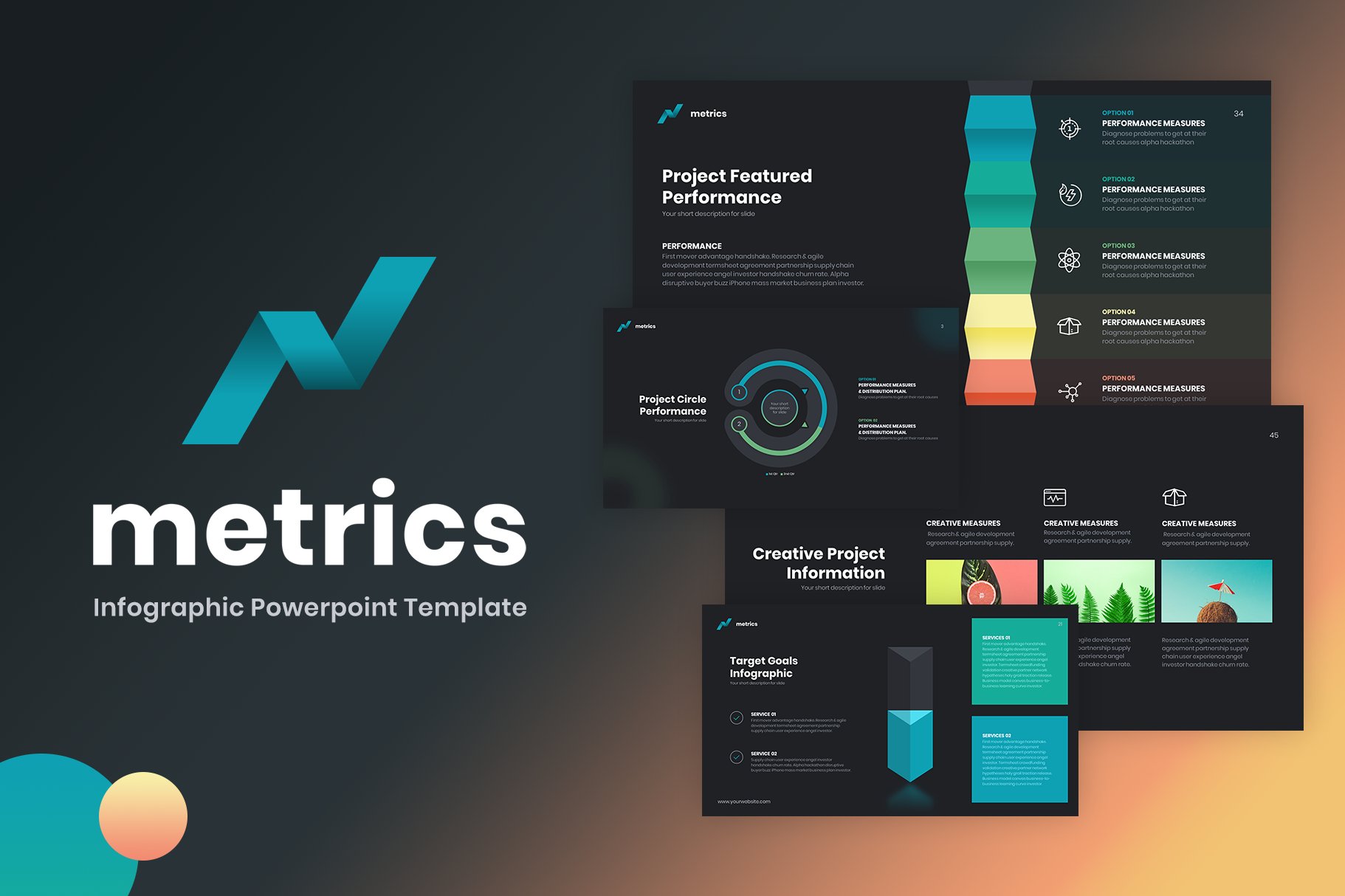
Metrics Infographic Powerpoint by Reshapely is a wide selection of neatly designed infographics built to be edittable within PPT.
When looking at this suite, consider how easily it can be adapted to suit your presentation style. There aren’t enough regular slides for this to be a complete all-in-one product. That’s not what this is about. Metrics Infographics excels at aesthetics in data display.
Right now it’s developed in dark mode, so you will probably need to switch it out to a lighter tone. That’s a quick fix. What you do have is 80 quality slides with little filler.
The colour palette is a UX charcoal and muted rainbow. This is a good starter palette, but you should adapt it to you company needs.
Timelines, portfolios, infographics, charts of many kinds, pie charts, creative bar charts, 3D illustrations, tables, devices, a handful of maps, arrow based slides, data displays plus a 500+ icon set are all bundled up.
The typography has a clean hierarchy and balance which gives a good indication to proportions and spacing.
The fonts look good, but again, they are most likely to change to your required font.
It’s suggested to add your logo / branding to the top left corner, but there is enough space to follow any existing guidelines you may have. These slides are clutter free.
Included is a PDF preview of all the slides included to allow for quicker asset discovery.
Overall, Metrics Infographic Powerpoint is a very useful product to compliment a primary layout design and one that will be reused as time goes by without feeling quickly out of date.


